I’m going to pick on @strawgate a bit in a sense, but the issue really isn’t @strawgate but the way the new ISV stuff is implemented in BigFix.Me
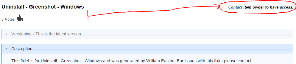
Most of what @strawgate is posting to BigFix.Me isn’t available to download because it is a new ISV thing, which I completely understand and have no problem with:
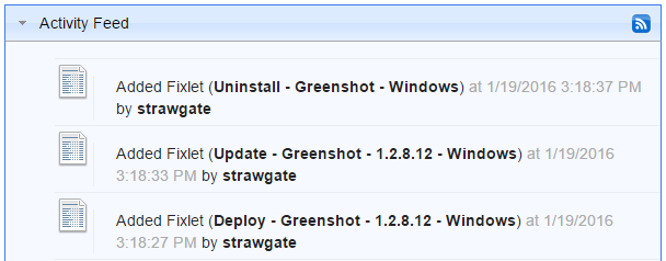
The issue is that these items are cluttering up the Activity Feed which I am less a fan of: (I’d rather the feed only contain community posts)
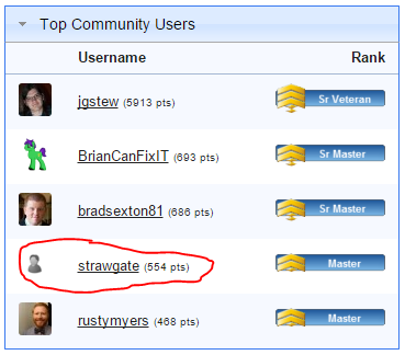
Also, these items that are shared but not downloadable by anyone should not count towards the reputation points that go towards being listed in Top Community Users
Only publically available items should count towards this reputation score, particularly because they are otherwise not available to the community. Also a ISV could upload an unlimited amount of junk files in order to game the Top Community Users without anyone able to tell that they are infact spamming / gaming the system.
And while I’m complaining about Top Community Users, it seems like BrianCanFixIT only posts unmodified IBM content. This is fine with me in general, but it shouldn’t count towards the reputation score for Top Community Users either.
I thought so, but I figured I’d make a post about it anyway.
Yes, definitely. I do get that this is more or less a BETA so things are rough around the edges, but these things definitely need addressed.
I’d obviously prefer more of the public sharing participation, but more attention is a good thing overall.
I think something that is complicated is the case where there are both publicly shared items and privately shared items that do the same thing. I don’t think it is really a problem, it is just a bit odd. On top of that having multiple ISVs share the same thing that is also publically available would be even more messy.
I would say that ISV posts should not be listed in Google results if possible, and they should have lower priority in BigFix.Me internal searches. I don’t have an issue with them appearing if they are the only option, but I’m going to be frustrated if I can’t find my own publicly available copy and can only find a privately shared ISV version of the same content.
I think having private content appear only in the feeds of users who are subscribed to the site makes a lot of sense. I think having it appear in search in a separate section also makes a lot of sense:
I’d imagine if you are subscribed to the ISV site, then you’d probably want that to come first instead of last, but that shouldn’t be the default behavior for users who are not subscribed or who are not logged in.
First of all thanks a lot for yours comments/suggestions.
I have in mind to do a rework of the home page to create separate “lists” for new public content and new private content, I think that is important to leave the private content list visible for all, because it can be a good advertise for the new feature developed on bigfix.me , for the ISV user and its content .
To mitigate the problem in the search I can add the lock icon to indicate the private items and if the user is not authorized I’ ll put them at the end of the results list .
In the results page I can also add some filter options like you can see in the http:// bigfix.me/user/mycontent view and include the filter private/public.
Overall, I’d say the recent changes to BigFix.Me are an improvement, but I do want to bring up something that was there before that I didn’t like.
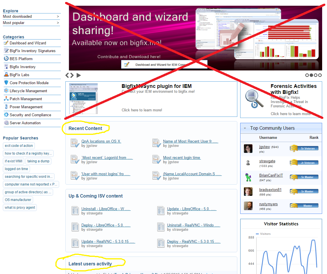
Most of the content towards the top of the page in the right hand area are not useful for repeat visitors. Maybe it would be fine to show users that are not logged in, but as a frequent user of the site, it takes up way too much space with very little value.
To me, the most useful areas of the new site are Recent Content and Latest users activity, while the areas marked with the Red X are not useful to me. I can see the reason for the BigFixMeSync plugin for IEM and Forensic Activities with BigFix! parts, but they are just in the way for me. They could be moved down to be lower in the page than the other items, or only show up if there is no user logged in.
I feel like the Top Community Users section could be expanded to show the top 10 users instead of only 5.
The Visitor Statistics is kind of cool. For some reason I find it interesting and useful, but I also don’t think it hurts anything to have it be pushed down the page by a larger Top Community Users section.
I like the ideas of the Most Popular and Most Downloaded. The Highest Rated would also make sense. I do wish they would have the option to see more than the top 10 in these categories though, perhaps by hitting a next button or something.